OVERVIEW
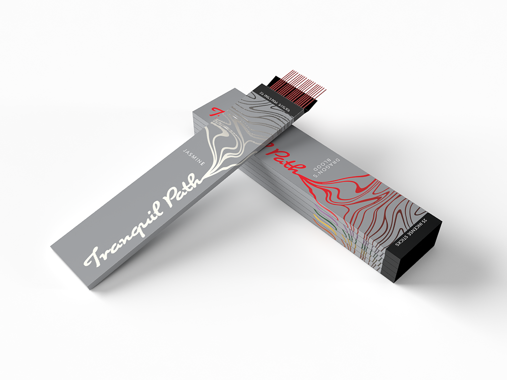
This project included the creation of a packaging series that coincides with the current offerings within Whole Foods Market. The product of choice for the series was incense under the brand Tranquil Path.
SOLUTION
The primary goal of this project was to provide a convincing product that can compete with their current inventory.
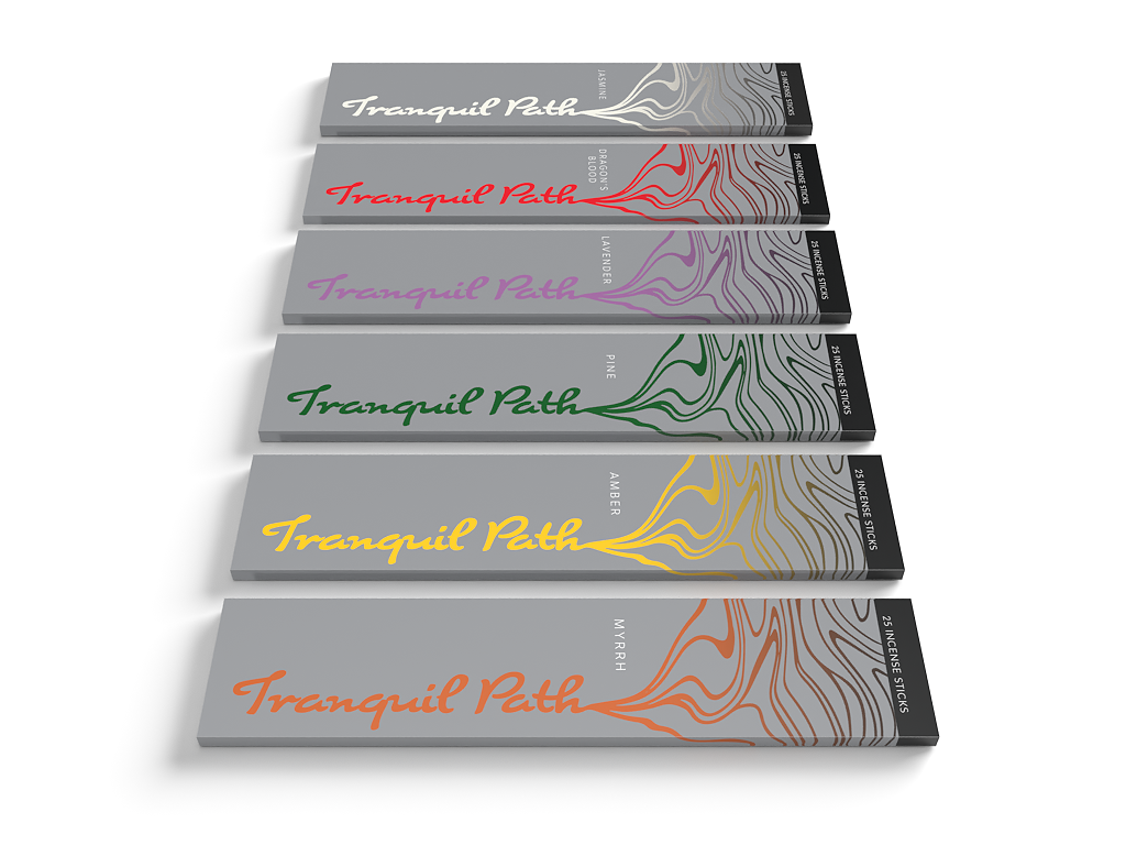
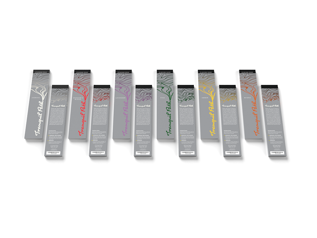
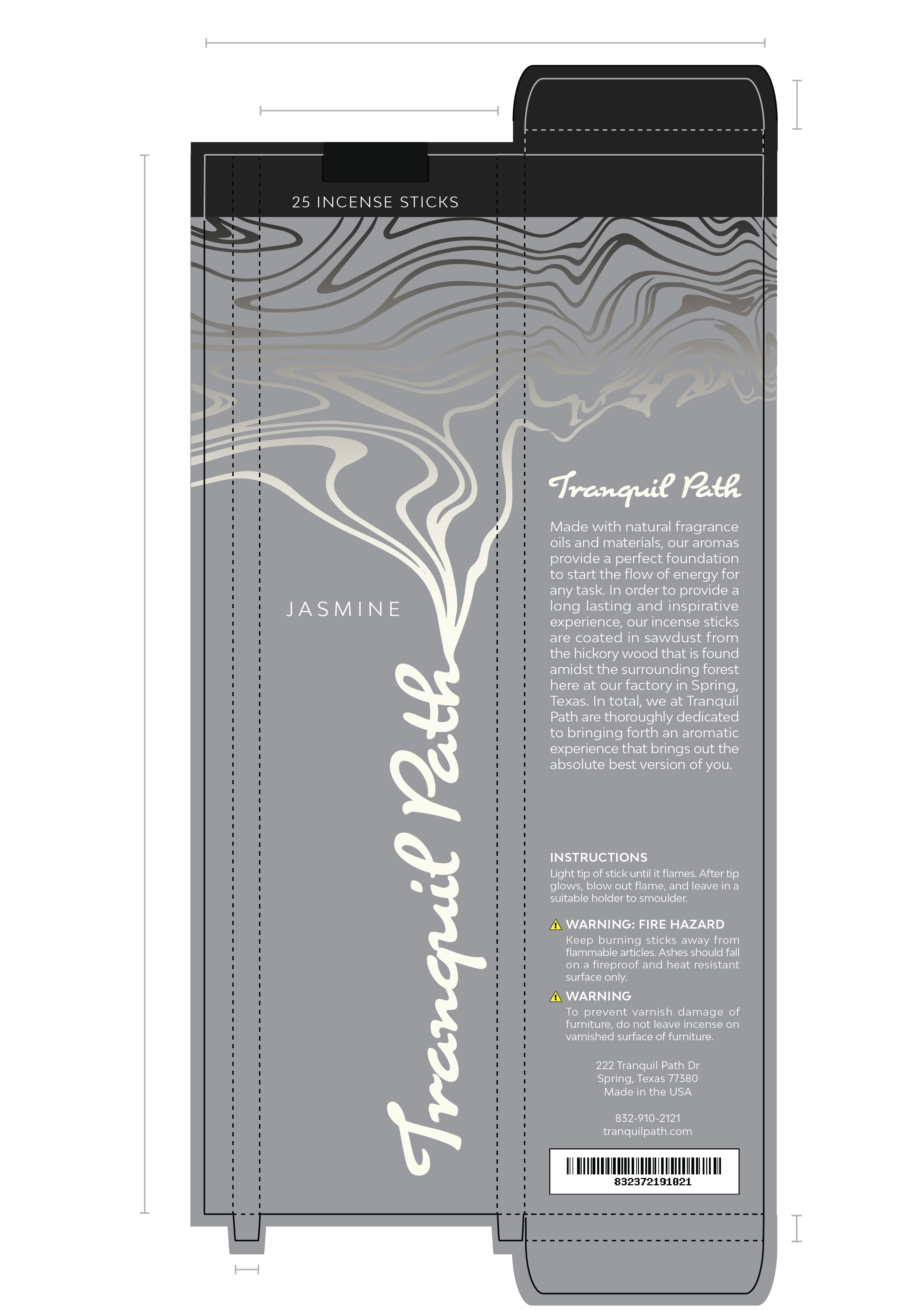
With the Tranquil Path Incense packaging, the box mainly utilizes neutral colors to combat the common earth tones that comes with incense packaging. Simultaneously, the use of gray and black exudes a sense of modernity. This also enabled a wide range of colors to exist within the typography and smoke imagery which, in part, provided a strong avenue for distinction within the series. The use of a script typeface produced a seamless relationship between the main ‘Tranquil Path’ title and smoke linework. With similar contours overall, the typography and smoke imagery come together as one cohesive element. This was done to give customers a direct perspective into the box’s product, even from a distance.


