OVERVIEW
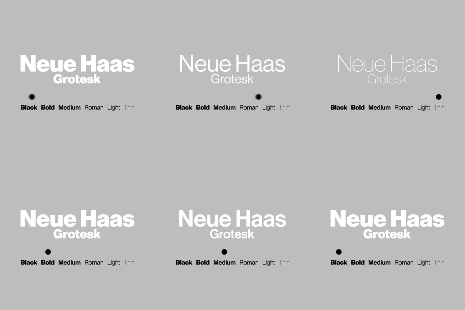
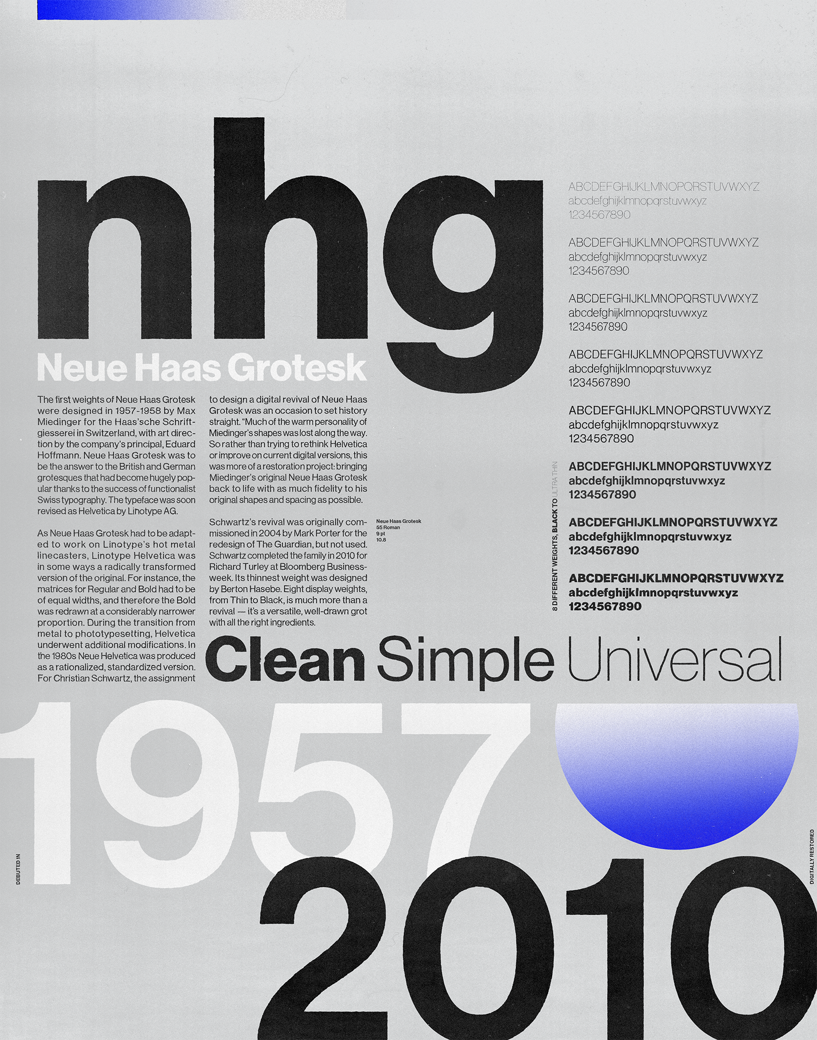
This project included the production of a poster and digital advertisements for the Neue Haas Grotesk (NHG) typeface.
The first weights of Neue Haas Grotesk were designed in 1957-1958 by Max Miedinger and Eduard Hoffmann for the Haas’sche Schriftgiesserei in Switzerland.
The typeface was soon revised and released as Helvetica by Linotype AG.
SOLUTION
Clean and functional are the primary characteristics of Neue Haas Grotesk, hence the headline ‘Clean, Simple, Universal’. In order to highlight the versatility of the typeface large instances of lowercase and uppercase appears at the top which is followed by four paragraphs of set type. In addition, large instances of numbers appear at the poster’s bottom (which also highlights the typeface’s history). This is all tied together in the full alphabet displays of all weights on the right hand side.


