

BILINGUAL EDITORIAL
Reserve Magazine Editorial Design
OVERVIEW
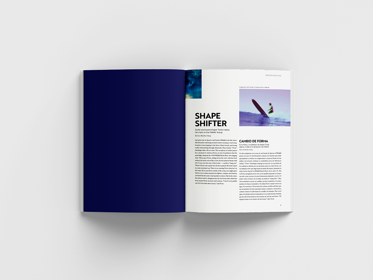
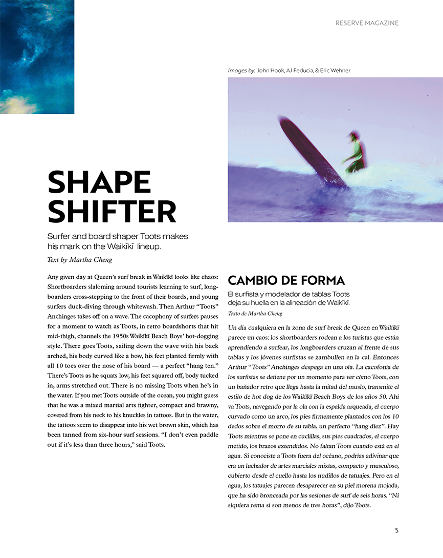
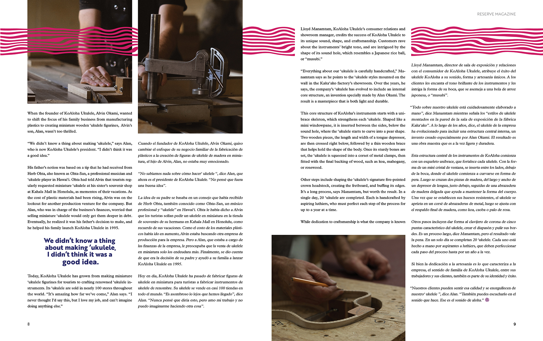
Completed for Advanced Typography at Chapman University, this project included the designing of a bilingual editorial for Reserve Magazine. This edition pairs English and Spanish to draw appeal to the ever expansive volume of Spanish speakers within California. The article’s copy revolved around surf board and ukelele production by local Hawaiians.
SOLUTION
The first concept, both visually and metaphorically, contains figures that are going against the grain just like Harry is working for the police while still harboring a deep hatred for them. The second concept touches on the action within the novel alongside lavenders, which is a recurring visual motif that appears in Harry’s thoughts due to his PTSD. The third concept covers the duality in Harry’s occupation as a medical examiner for the London Police.


